Pondering Paint
How Pantone decides Color of the Year and what that means for the world
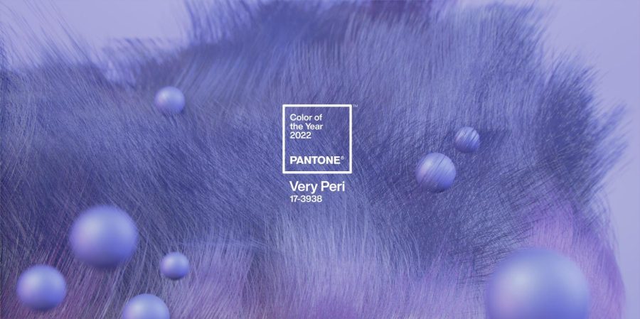
Pantone created a new color, Very Peri which they described as the warmest and happiest shade of blue. – Pantone.com
Did you know that the color pink calms and reassures our emotional energies? Orange is highly-stimulating but also playful and friendly.
Colors have meaning. We associate them with places, people, objects, and memories. But the company Pantone has the job of deciding what color should represent a whole year, and they have done so since 1999.
Every year, the company Pantone chooses the Color of the Year that serves as the embodiment of the world’s spirit and perspective. Their selection has lasting effects on a majority of products in the consumer industry from fashion to home design. Following this color’s release, designers attempt to implement it into various consumer products. It serves as a launch pad for new trends, and it all starts with one color.
“I always look forward to the Pantone color of the year coming out and seeing how it affects things like fashion going forward into the year and noticing it being worn and appearing in our lives,” said Ms. Janelle Manasan ‘10, who teaches Art I at Notre Dame.
Pantone also gives insight into why the color was chosen. Some years two colors are chosen. For example in 2021, Ultimate Gray and Illuminating, a vibrant shade of yellow, were both picked and paired together to convey a powerful message of strength and positivity–something everyone needed as we were knee-deep in the COVID-19 pandemic.
This year, for the first time in Pantone’s history, instead of choosing from existing colors for the color of the year, the company created a whole new one. They stated that the decision to produce a new color reflected all the changes in the world currently.
On December 9, 2021, Pantone revealed “Veri Peri,” a blue hue with violet red undertones, as the color of the year for 2022. This is what the company had to say about the new color.
“PANTONE 17-3938 Very Peri displays a spritely, joyous attitude and dynamic presence that encourages courageous creativity and imaginative expression. As we emerge from an intense period of isolation, our notions and standards are changing, and our physical and digital lives have merged in new ways. With trends in gaming, the expanding popularity of the metaverse and rising artistic community in the digital space, Very Peri illustrates the fusion of modern life and how color trends in the digital world are being manifested in the physical world and vice versa.” —Pantone.com
Certainly, the Pantone Color Institute, the branch of the company responsible for choosing the color of the year, sees the world not only moving forward from the pandemic, but also sees a shift in the way we live and view life.
While Very Peri might be a reflection of our world, we can also count on the same color to positively impact our moods, feelings, and behaviors.
The feelings evoked by color are influenced by a personal connection nurtured by our unique experiences and cultures.
Mr. Joseph Lee, Notre Dame’s Visual Arts Department Chair said, “When things are neutral, like your blacks and whites, you really pay attention to the form. So that’s the piece in its most minimal form. When you start adding color, then you begin to experience cultural references, and it starts signifying certain emotional states and places, like your origin. Everyone reads color in different ways.”
Some colors have universal meanings like the association of tranquility with cooler colors, or happiness and optimism with warm colors. However sorrow is often tied to cool colors, and warm colors sometimes represent warning.
“Artists tend to use color to evoke different emotions and feelings. Picasso was most known for having his ‘Blue Period’ when he was depressed, and then his ‘Pink Period’ when he was in love,” said Ms. Manasan.
The Pantone Color Institute also distributes color predictions and fashion reports. The color of the year is affected by design trends seen in various industries. The Color Institute uses extensive research by delving into color psychology and consulting as well, working with with brands to utilize the power, psychology and emotion a certain color incites for an effective design strategy.
“Designers use opposite colors which are called complements, to get you to notice products. Healthy brands will use green so you think it’s healthy, just because the color looks very natural,” Ms. Manasan said.
This approach is also utilized in places like restaurants, hospitals, and schools to create a specific ambiance.
Mr. Lee said, “A place like Starbucks has a very earthy tone, and you feel settled. Whether you want to go on your computer or read, those colors are congruent to the experience.”
In contrast you might notice a very different motif in a place like McDonalds. “Usually fast food places in the past would have yellow and red which are really anxious colors. So you would eat and leave right away. Now they want you to settle in, so they change their color scheme,” Mr. Lee said.
In order to determine the color of the year, Pantone explores trends and searches the world for new color inspirations. They can be found in the entertainment industry, art and new artists, fashion, design, travel, lifestyles, playstyles, and socio-economic conditions. New technologies, materials, textures, and effects, relevant social media and sporting events that garner worldwide attention are all influences Pantone considers.
To determine the specific color, Pantone holds private meetings with various experts of color standards from several nations where they debate and present different proposals. Their choice centers around the world, specifically a term called the zeitgeist which refers to the mood, ideals, beliefs, and tone that motivates people during a particular period in time.
While competing companies also have their own color of the year, it is Pantone that stands out among the rest. The company has decided on the designated color since 1999. Pantone is a major influence in the design world which is why their announcement of the color of the year is the most significant compared to competitors. In 2015, sales for Marsala, a wine red with earth tones, color products such as paint, bedding, and upholstery skyrocketed after it was named color of the year by Pantone.
Pantone 17-3938 Very Peri’s creation and meaning symbolize our desire for a fresh start for the world in 2022.