
LOOK UP; COLOR IS DOWN!
Color is disappearing for our world, but are we even noticing? Why the array of gray matters.
“What is your favorite color?” Is one of the questions notoriously asked at the beginning of every talking phase/situationship, school orientations, and most surface level introductory conversation. Many of us allow our favorite colors to dictate what we buy, in terms of clothes, accessories, school supplies, your toothbrush, as a way of representing what we like or who we are. We’ve allowed color to speak visually for us as humans are highly visual beings.
So as creatures who heavily rely on visual cues, biologically and socially, what does it say about how we are currently doing as a society when recent AI Research exposes that color has been disappearing from our world?
This research was done by machine learning that tracks color changes in the most common materials and items, and in this study over 7,000 items were tracked from the 1800s to today in order to establish the color changes in everyday objects around us over the past 3 centuries. The chart below was generated by the machine learning data and it revealed that the use of color has significantly dropped over time.
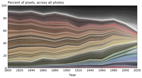
Despite our times having the best camera and printing technology for high definition movies, shows, photos, books, magazines and all things media, why is our modern world as colorful as the black and white printing of the past two centuries? It is not only dull and slightly depressing, but it may even be harmful.
The style labeled “modern” in every industry, like fashion, furniture, interior design, architectural design, etc., leans towards this minimalistic design that has a color wheel that seems to only consist of black, white and a gradient of differing beige and gray hues in between for those who like to live on the wild side.
One of the reasons for the decline in shade range can be found in the economic climate of America. Good quality marketing identifies a consumer and seeks to meet their needs with a quality product that will in turn create a profit; however, when quantity becomes prioritized over quality and mass production reigns victorious, ignoring the fundamental principles of quality marketing.
Because assembly line mass-production allows for massive quantities of an item to be accessible for as many people for everyone to consume quickly and largely at a low cost, which usually reflects in a lower quality. The lower quality is already an eyebrow raise, but the real concern is the lack of uniqueness and color in the abundant amount of mass produced items. Products, houses, cars, home furniture trends, etc. become monotonous with the label of “modern.”
All US suburbs have this monotonous look to them, even the more high end ones, since they’re usually under one builder who only builds 3-4 styles of houses, creating these cookie-cutter neighborhoods with identical suburban homes that “weren’t grand palaces, but to the generation that had survived the Great Depression and World War II these little cottages represented almost unimaginable luxury” (Khan Academy’s “The Growth of Suburbia”).
Traced back to the post-war boom in the 1950s when American suburbia blossomed since the economic boom paired with the baby boom and increased incomes allowed Americans to afford these homes in comparison to the arm and leg an apartment would cost. The identical floor plan is actually what allowed suburban homes to be more affordable since the process for each home was the same with the same distinct steps.
Although cost effective for homeowners since the 50s, suburbia does encourage little to no allowance for coloring outside of the lines. Everything is uniform, lacking in individuality, character, and obviously, color. Suburban homes are just one of the many obvious pinpoints for the decrease of color in our world.
But seriously, when looking at the homes in new neighborhoods, the cars on the road, and new renovations in city buildings, my line of vision is bombarded with gray and beige. It’s giving 1984, George Orwell, dystopia..
With the lack of individuality in all aspects of our modern society, at what point did production and marketing’s universality start to feel a little more like conformity?
The advantages of the tiny color selection and decreased quality can be found in corporations bank accounts; however, the consequences are found in the universality of the products of what is mass produced and mass consumed. Nick Hobson, in his Inc. article, New AI Research Shows That Our World Is Becoming More Boring and Less Colorful, points out that “in a data-driven world, everything gets standardized because our algorithms tell us that’s what people like on the whole. Our individual preferences ‘regress to the mean.’”
In order to produce more for the average, modernism markets plain and gray as sleek and clean. Where did the personality and vibrancy and character go? Color peaks individual interest, but did we stop being interested? Did you notice the gray before it was pointed out to you?
To combat the sea of gray, we must recognize the benefits and advantages of color. Color peaks individual interest. The aesthetics of our environment influences the moods and attitudes in the air. Being in a space that is overflowing with liveliness and passion must entail color and patterns and design. Hannah Blake ‘23, AP Art student points out, “Mental health flourishes in places that are colorful and happy. Just pointing out the obvious, if you’re in some colorless place like a prison, you’re going to feel gross and trapped.”
With ND undergoing its own set of renovations and upgrades, it’s imperative we keep in mind what we want our communal and individual spaces to reflect. Our mental health, frames of thinking, levels of productivity and moods will fluctuate as a direct consequence of our surroundings. Minimalism repackages conformity with the mask of simplicity at the cost of uniqueness.
If we lack an appreciation for the places we spend our time in because these places aren’t unique or special visually, that will bleed into our feelings and thoughts and eventually evolve our values. Start simple with tailoring to your individual interests and favorite colors with Murals, posters, paint and furniture are all ways we can embellish our spaces and our lives.
“Art and color are valuable aspects within urban planning because they are essential facets of visual learning and intake. Basically, color attracts the human eye and creates a visually pleasing and stimulating environment.” –Megan Pajarito ‘23